Philo was an exciting start up companythat started back in 2018. My friend Colin and I had the idea of creating a Vermont watch company with more of a focus on sustainability. We ended up contacting numerous manufacturers both abroad and domestically to try and make our idea come to fruition. We got as far as having 4 product samples made which I featured in the photography of the UI design. Long story short, our watch company didn’t come to life due to financial reasons. However, this project finally gave me the opportunity to explore how our online retail store could have appeared and functioned.
Brief
Philo is a startup watch company that sells minimalist wrist watches with an environmentally conscious approach. Their plan is to sell their products exclusively through their e-commerce website. They are just coming off of an extremely successful kickstarter campaign, and now they are officially ready create their online retail store.
High Level Design Goals & Objectives:
Design a logo for the company that is modern, luxurious, old-school and neutral to attract all types of audiences and styles
Design a responsive e-commerce website that is easy to use and allows customers to browse through all products
Key Features:
The website needs to be responsive so users can access it from any device (laptop, tablet, and mobile)
The website should be able to show all of their products
The website should allow people to filter products easily so they can narrow down the options based on their interests. Key filters should include watch collection, color, size, etc. The user should also be able to sort the watches by price.
Role:
UX Researcher, UX Designer, UI Designer
Tools:
Pencil & Paper, Sketch, Photoshop, InVision App
The Process
Research
Secondary Research 1:1 Interviews Empathy Map User Persona
Architecture
Sitemap User Flows
Design
Wireframes Branding UI Design UI Kit
Prototype & Test
Desktop Prototype Usability Test Affinity Map Iterations
Research
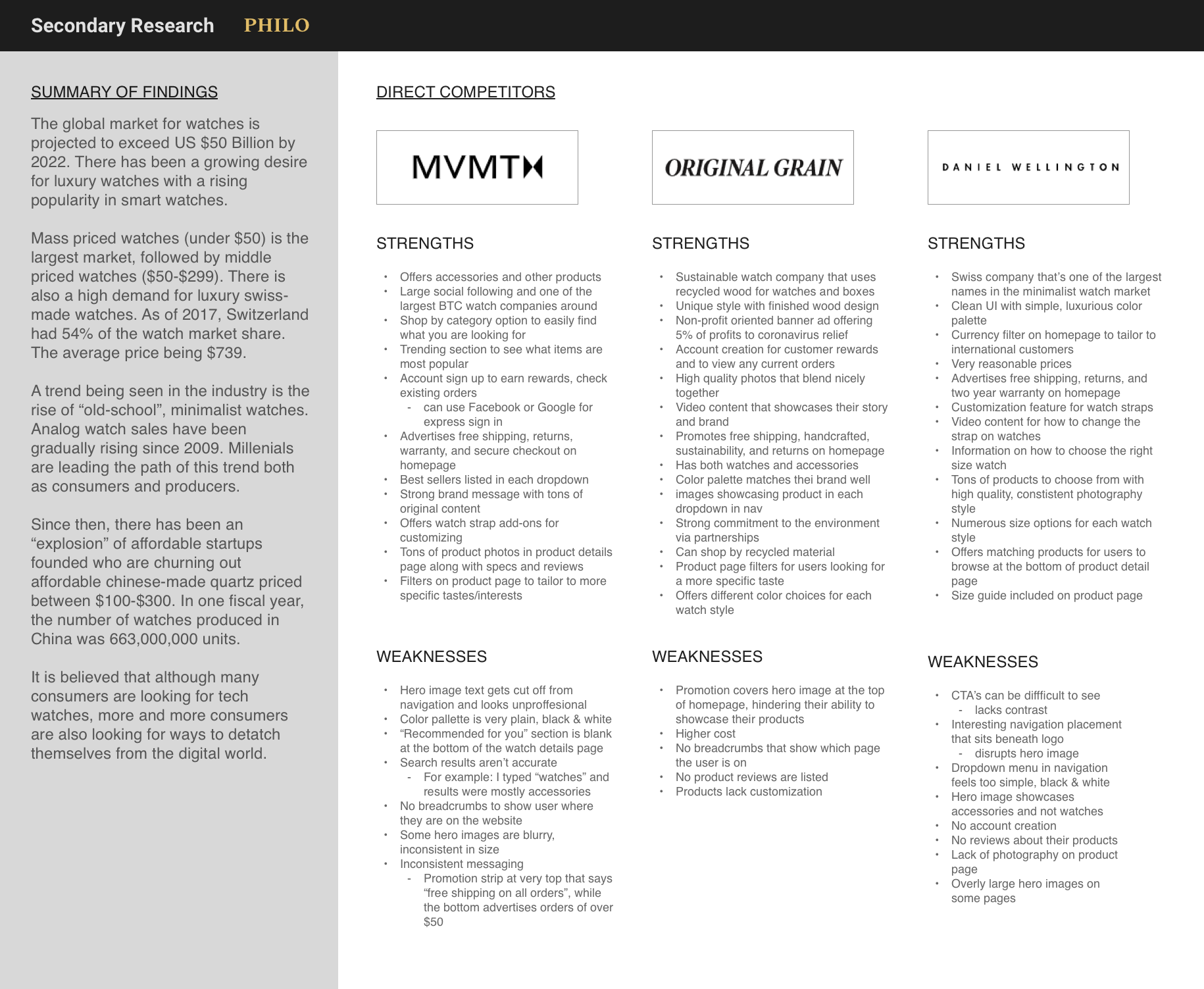
The process began by conducting secondary research to learn more about current industry trends, statistics, and competition. From the research, it was clear that middle-priced luxury watches were beginning to gain popularity in the market. Analog watch sales have continued to see growth since 2009 with millennials leading the way both as consumers and producers. Since then, there has been a strong rise in affordable startups that sell quartz-movement timepieces with most companies sourcing their product from manufacturers overseas.
Some of the most popular brands operating in this market include MVMT, Original Grain, and Daniel Wellington. All three outsource their products overseas and sell directly to their consumers making their products more affordable. Affordability combined with a user-friendly online storefront has led to their success in the industry. Some notable website features that have contributed to their success are the integration of social media, account creation, quality photography, watch customization and more. These key attributes and design patterns were noted for considerations later in the design of Philo’s website.
User Interviews
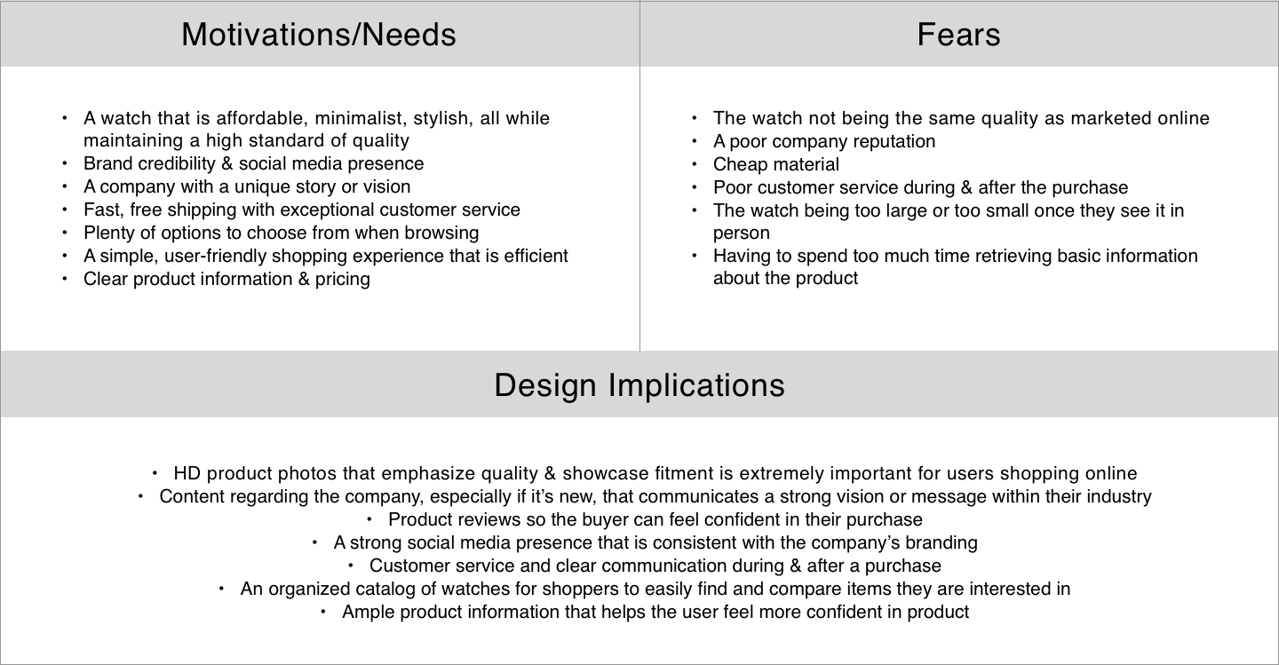
The next step in my research was conducting 1-1 user interviews to gain a better understanding of their wants, needs, and fears when shopping for a new watch online. I interviewed a total of 5 participants between the ages of 24 and 27. Each of the participants had either purchased a watch online within the last 6 months or plan to do so in the near future. After the interviews were completed, some commonalities began to emerge in my notes.
Synthesizing Our Findings
To begin synthesizing the qualitative data collected, I created an empathy map for our user. By breaking down our research into the 6 categories seen below we are able to better understand our user’s environment and mindset. These insights eventually will help us design a product more tailored to their needs.
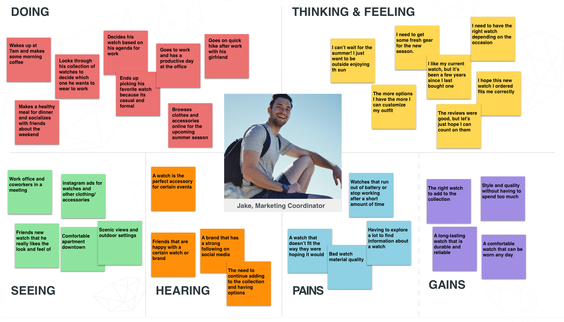
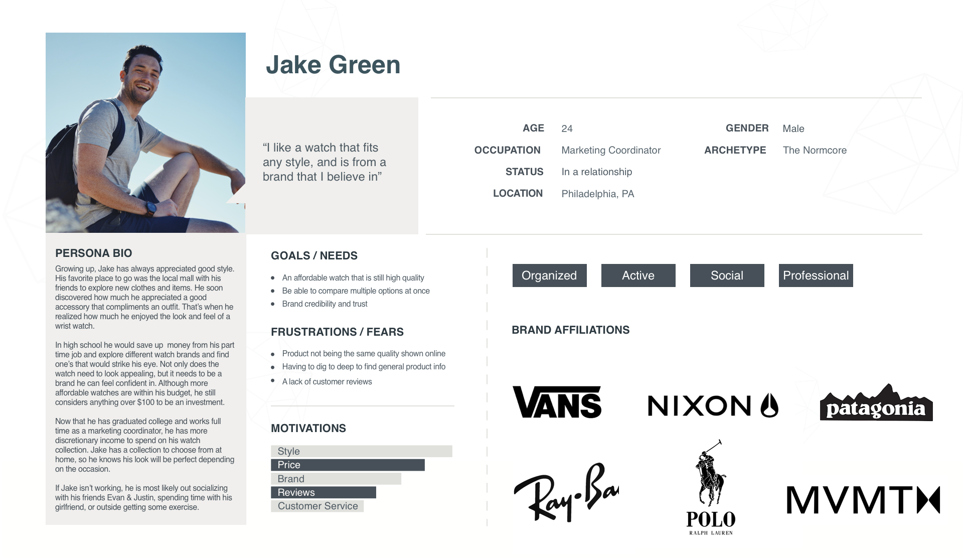
Meet Jake Green
Next, I created our user persona. This is a more humanized idea of the person or people we are designing for. Jake Green is a 24 year-old from Philadelphia that has always had an appreciation for style. Growing up, he loved going to the local mall with his friends to check out new styles. Accessories always appealed to him more, especially a nice wrist watch. He saved up to purchase his first watch in high school and has been building his collection ever since. He likes to buy watches from brands he feels confident in that has a vision he can stand behind. Jake is very price conscious and likes to spend as little as possible while still getting a great deal. In order to do so, he needs numerous options to compare consumer reviews, product photos and more.
Architecture
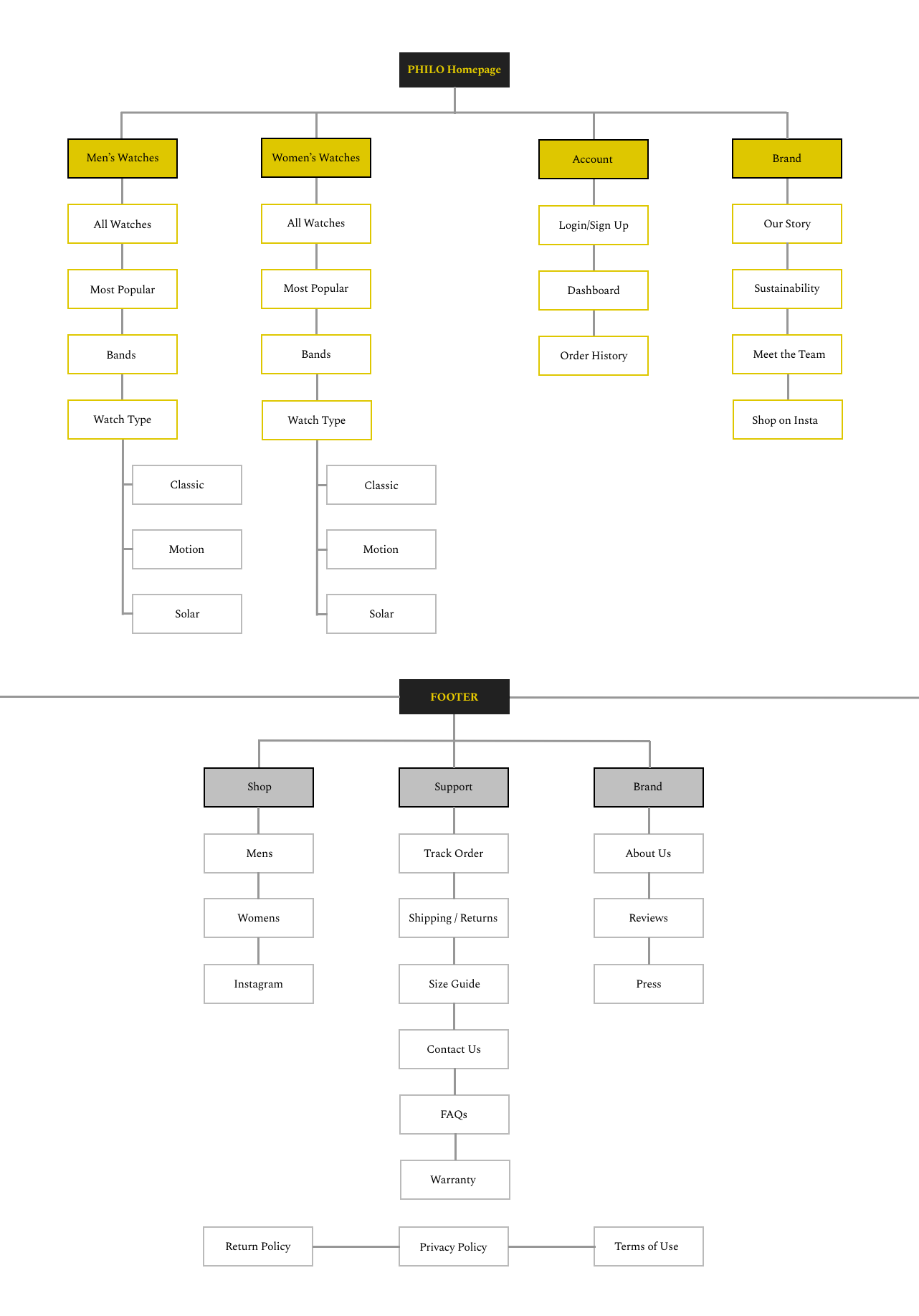
The next step in the design process was to begin organizing and labeling the content of Philo’s website in a user friendly way. Based on my research, users want an online shopping experience that is efficient, organized and straightforward. Given this information, I created a sitemap that focused on minimalism and would aid the user in finding the items they are looking for efficiently.
Sitemap
Finding a Watch
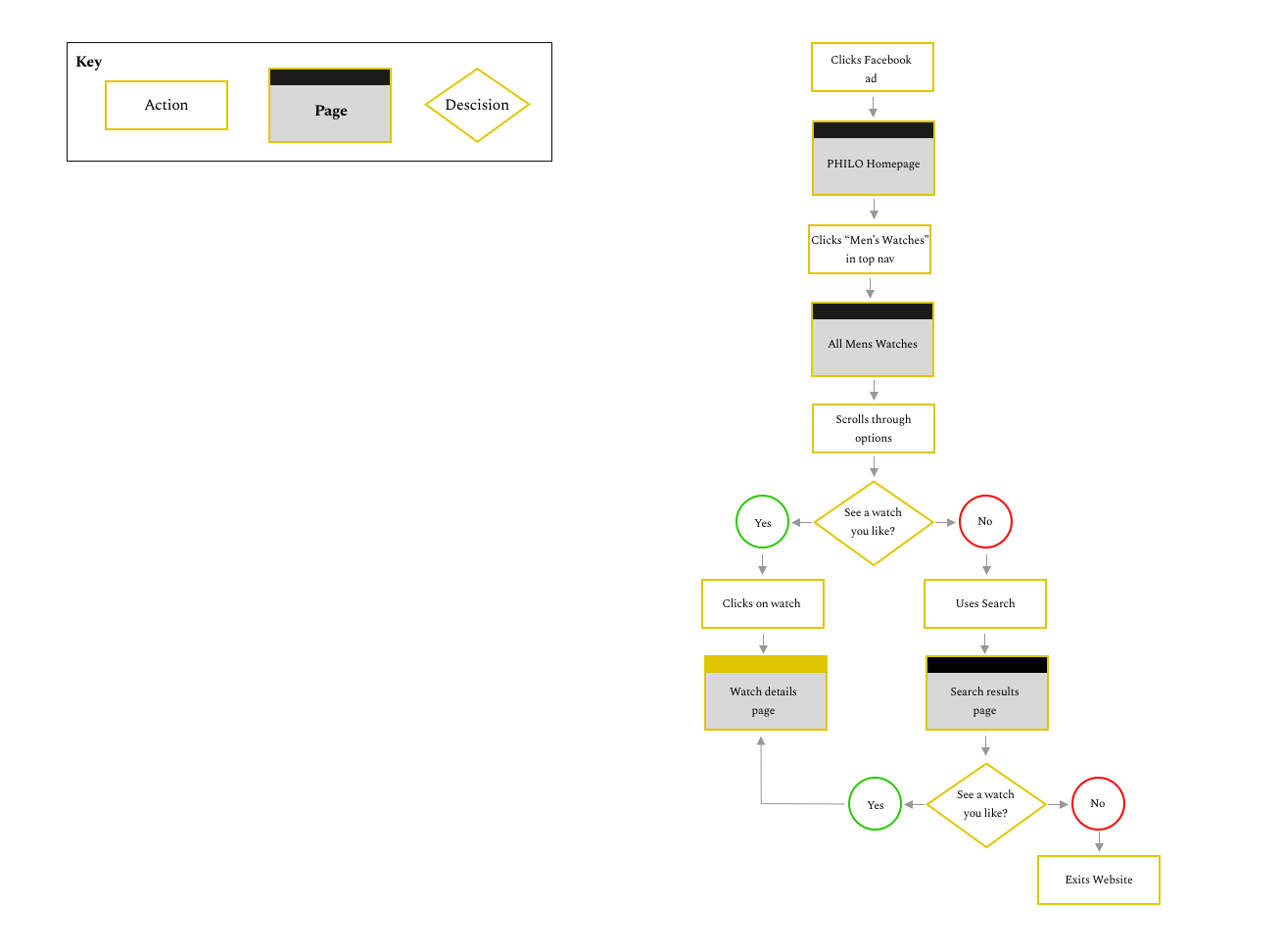
Next, I wanted to create the user flows for finding a watch and then making the purchase. In Scenario 1, Jake has been in the market for a new watch and saw an ad on Facebook for Philo. Jake clicks on the ad which leads to their homepage. From the homepage, he is interested in finding a watch that he likes.
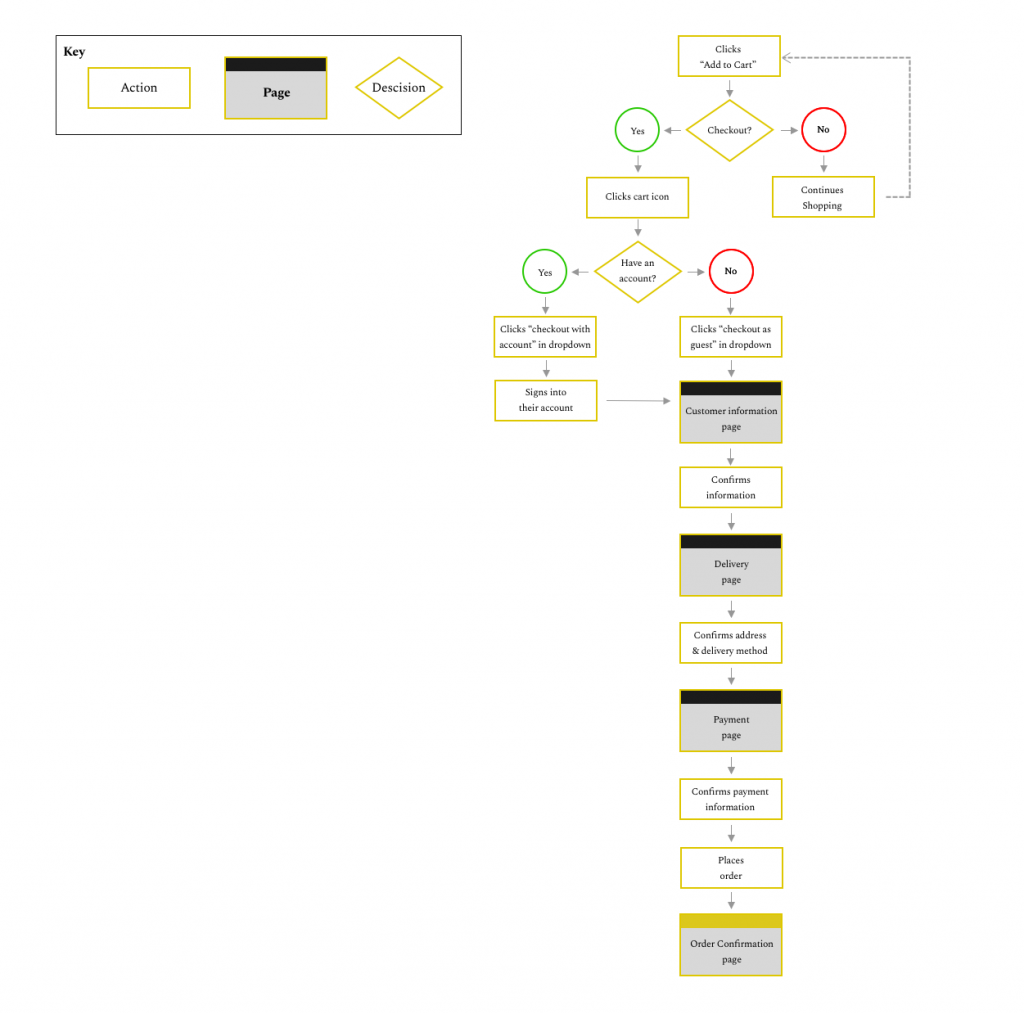
In Scenario 2, Jake has now learned enough about the watch and would like to make the purchase.
DESIGN
Bringing My Ideas to Life
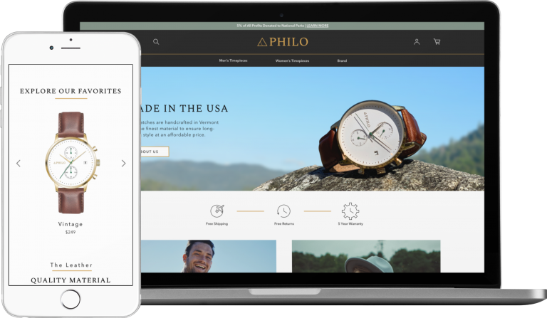
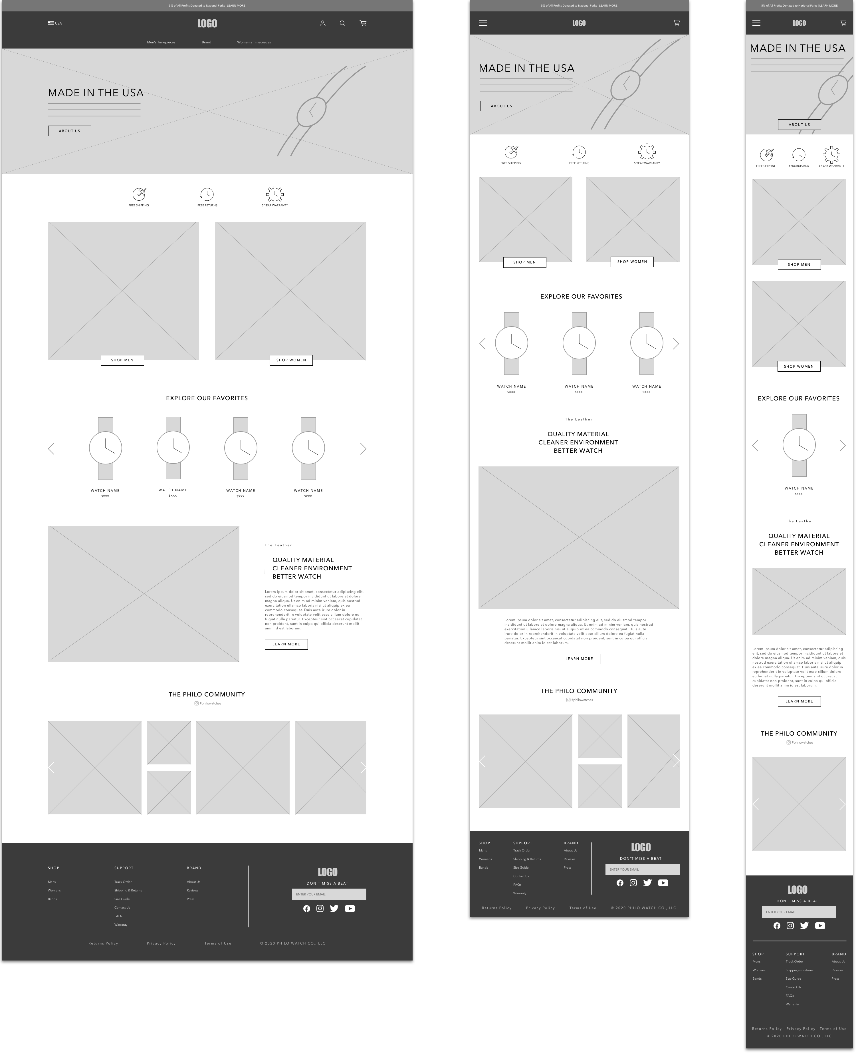
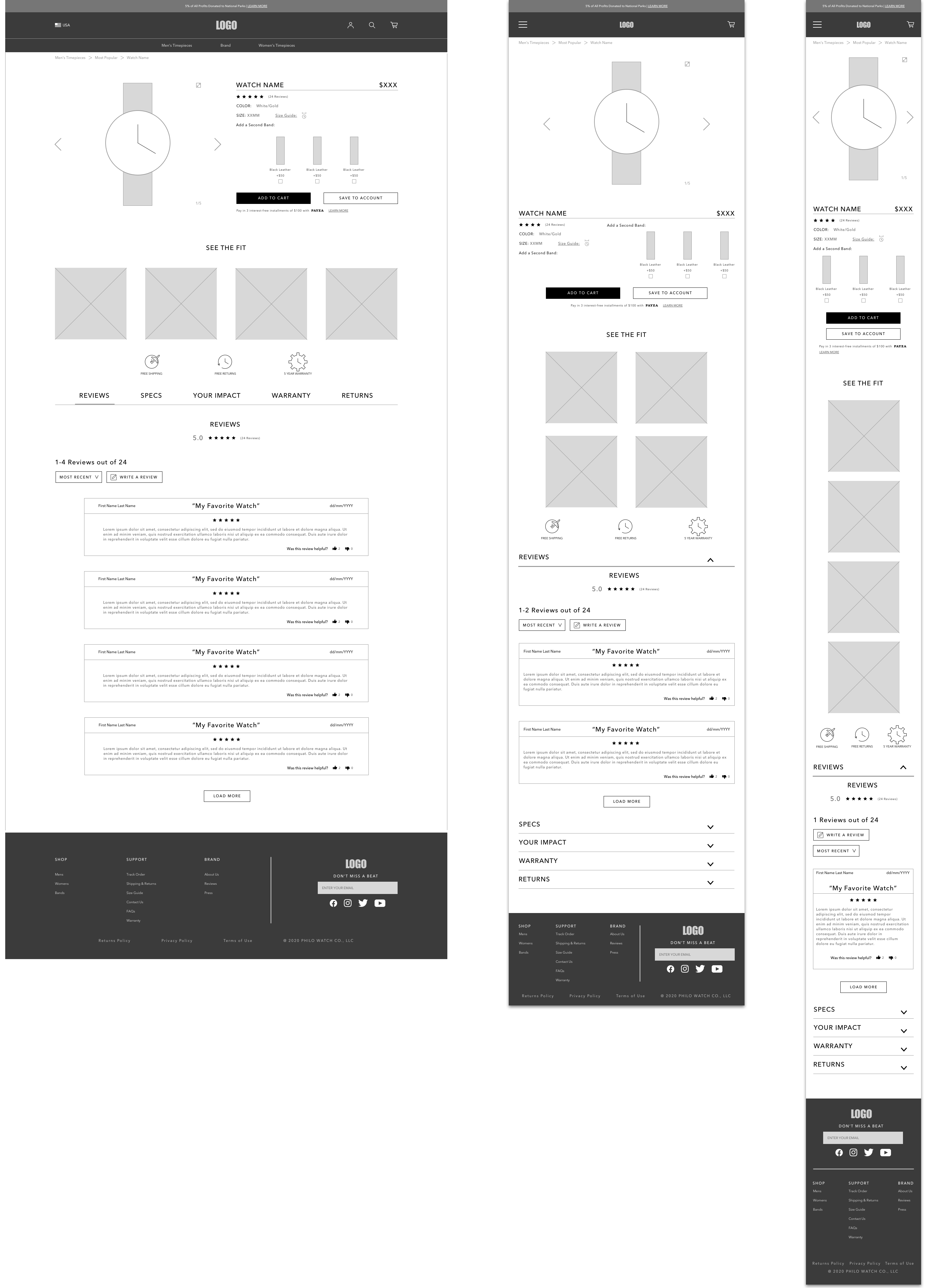
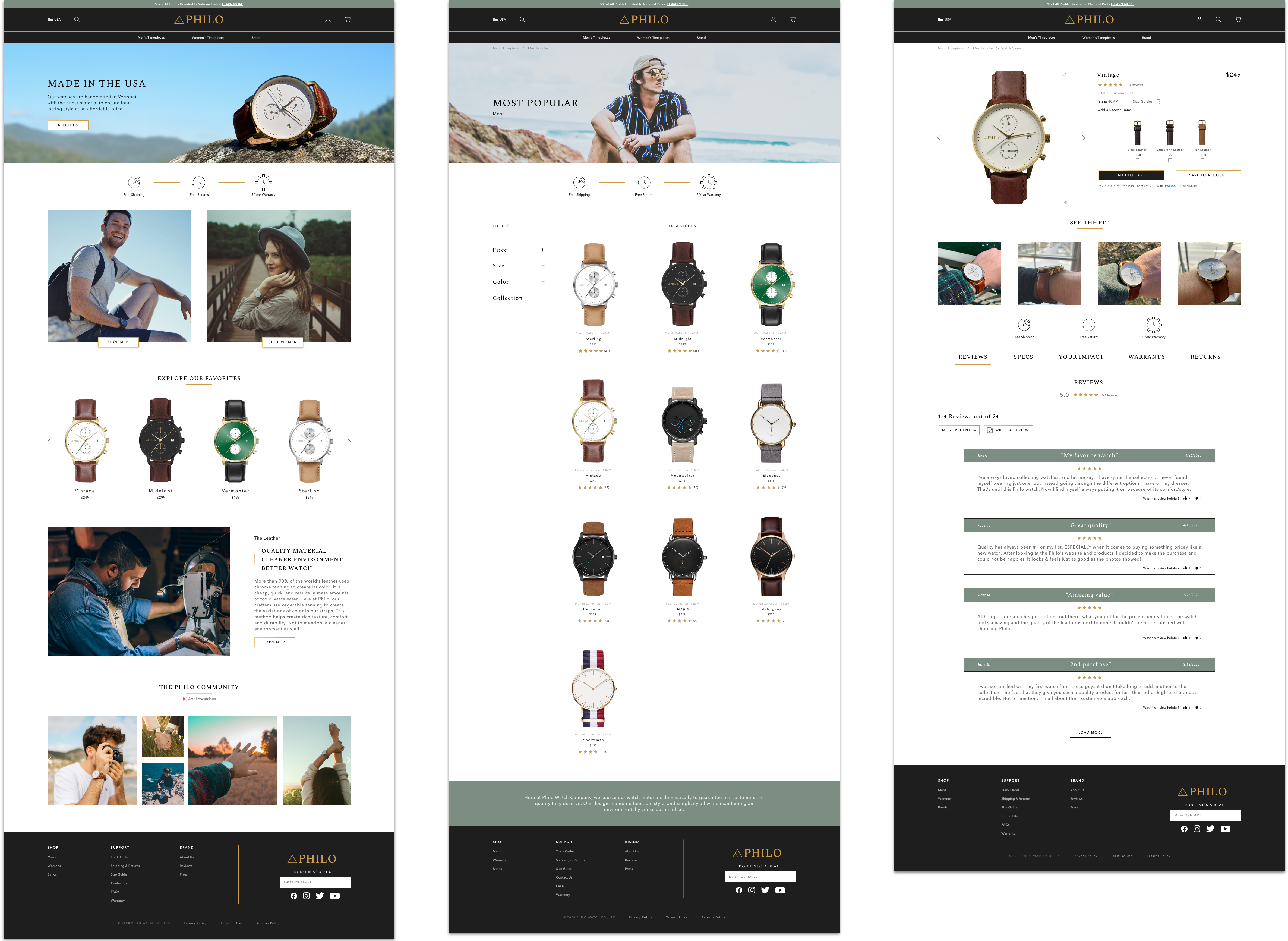
Now that I have formed a thorough understanding of the content structure and our user’s needs, it was time to design the responsive wireframes. Using design patterns seen across competitor websites, information gathered through our research, and the architecture of our website’s content, I designed the layout of Philo. Below are the responsive designs for the homepage and product page.
Homepage
Product Page
The Look & Feel
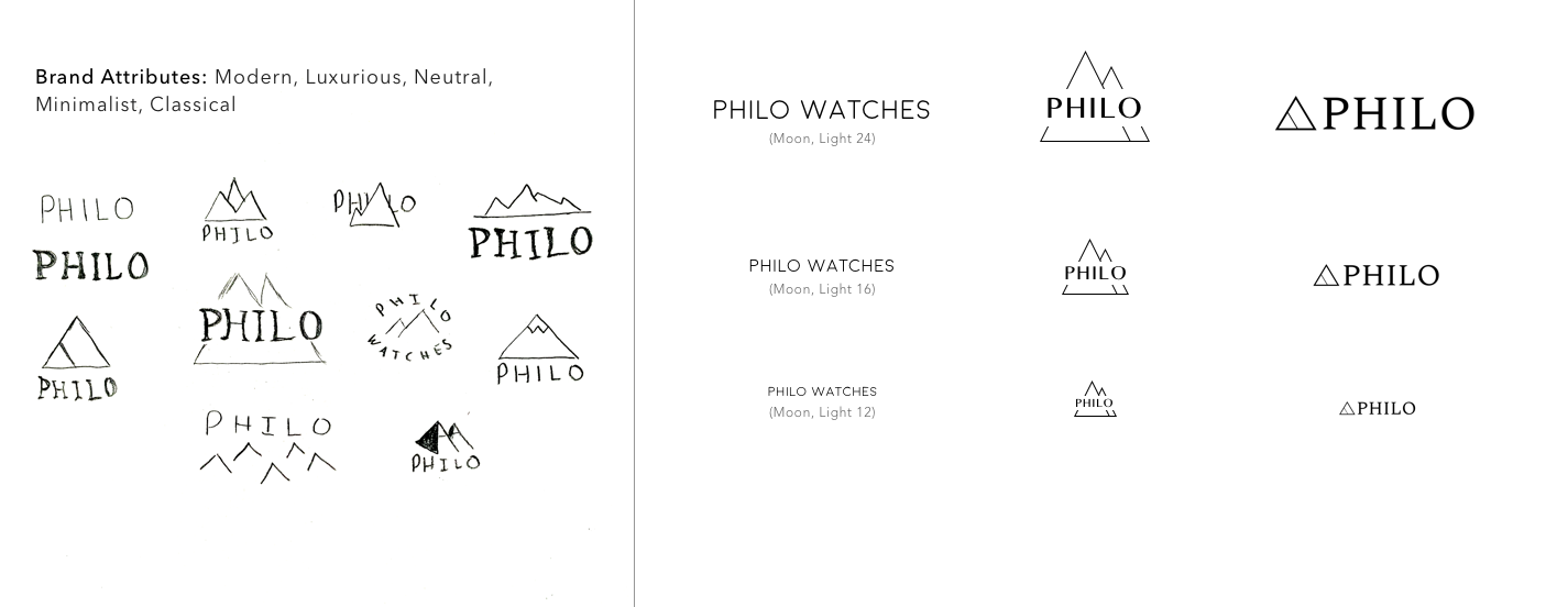
Now it was time to begin the branding for Philo. First and foremost, they asked me to create a logo that feltmodern, luxurious, old-school and neutral to attract all kinds of audiences and styles. They also wanted the logo to represent their minimalist approach to watch design. I used these key attributes to generate some ideas on paper. I then picked the best three options and transferred them to digital form. The logo chosen was to the far right, with two triangles representing mountains in a modern, minimalist way. A serif font was then used as a wordmark to complement the triangles on the left to contribute a more classical feel.
Logo Design
Visualizing the Style
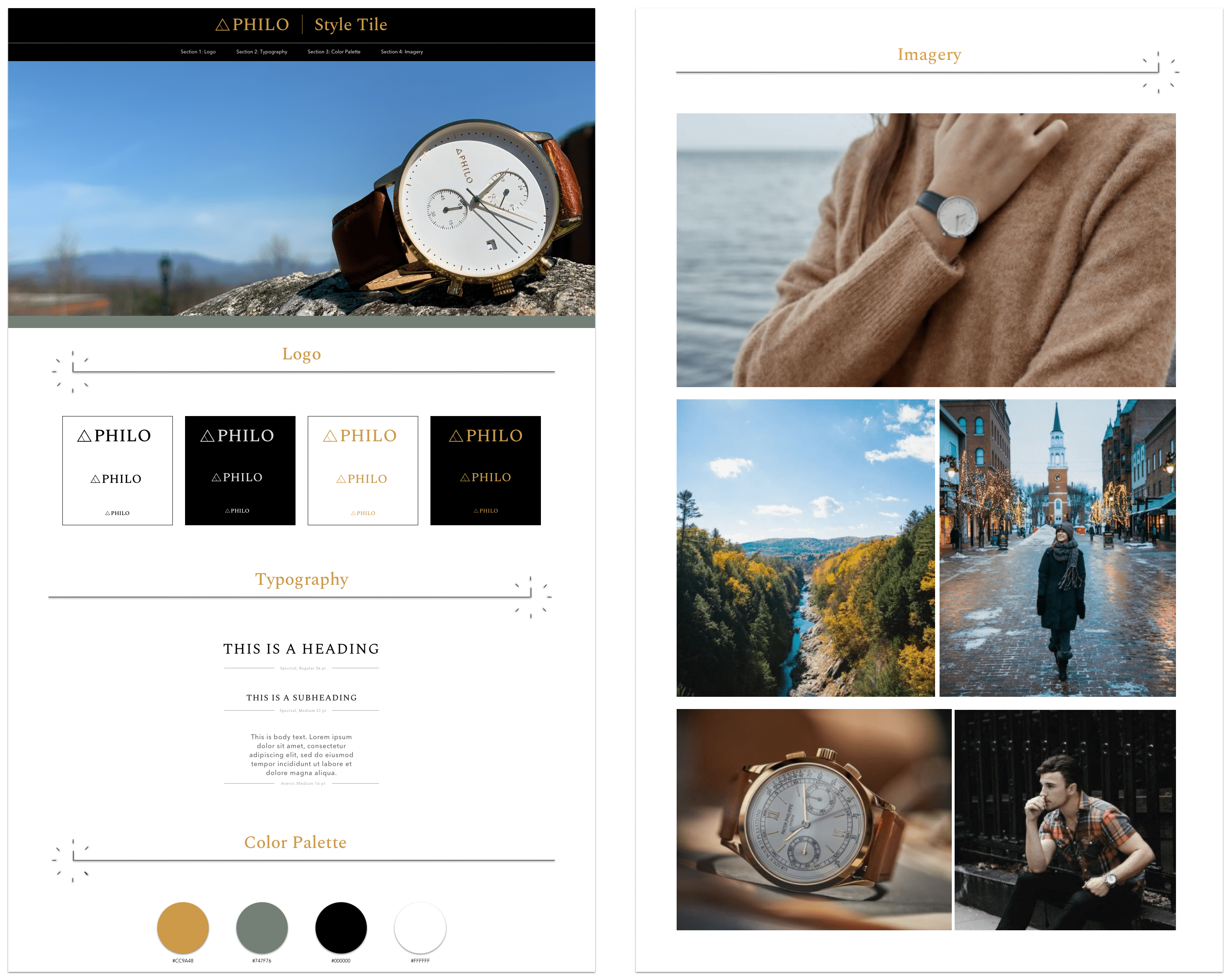
I created a style tile to help guide me in a general direction for the visual design. First, I gathered inspiration in a moodboard via Pinterest. After collecting ideas regarding the website’s photography, typography, and color palette, I created the style tile seen below. It includes image ideas, typeface options and a color palette.
The Product
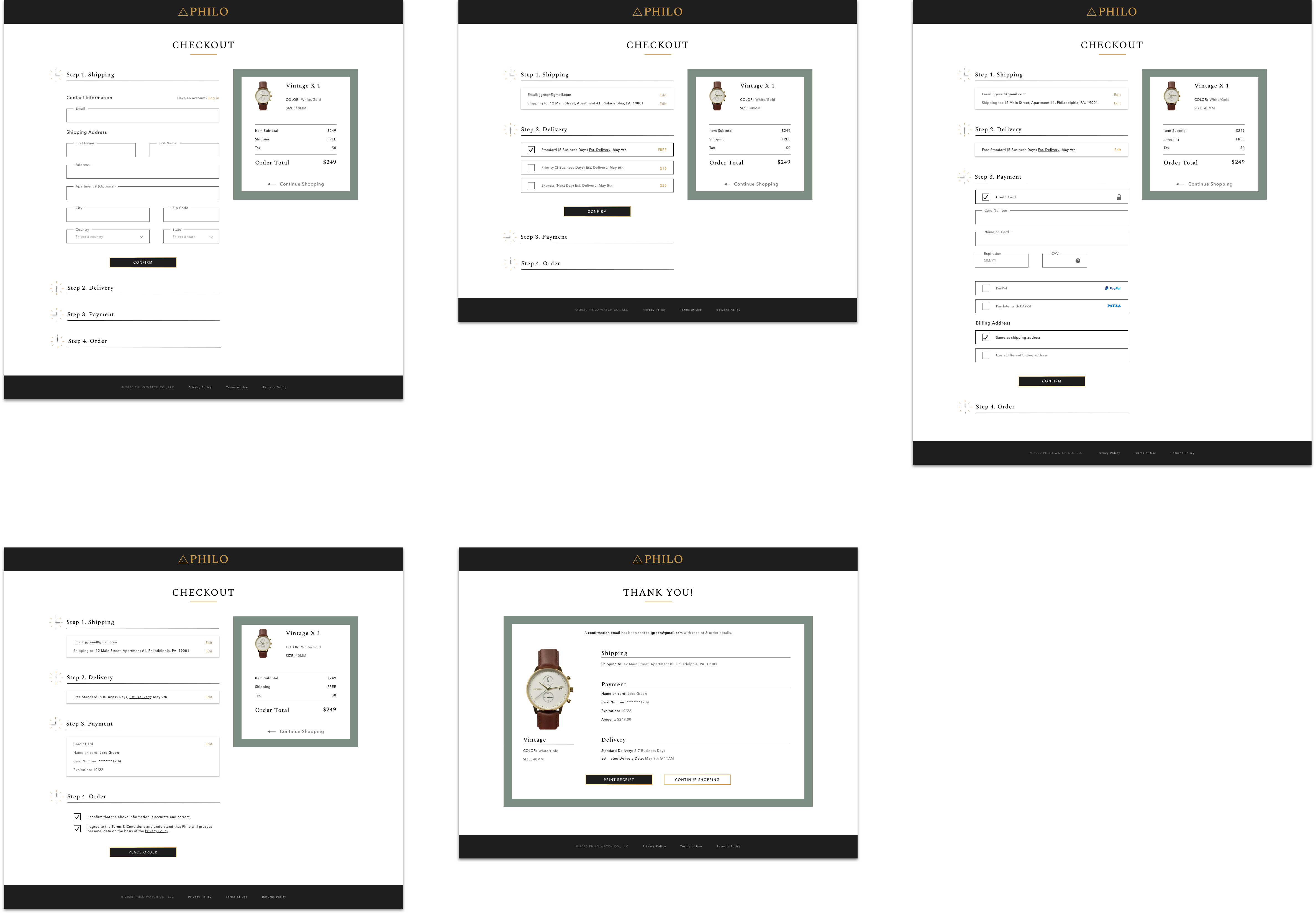
Using the style tile and some photography taken of the physical product, I produced the UI design for the website. Below are the Homepage, Watch Catalog Page, Product Page, and Checkout Pages.
PROTOTYPE & TEST
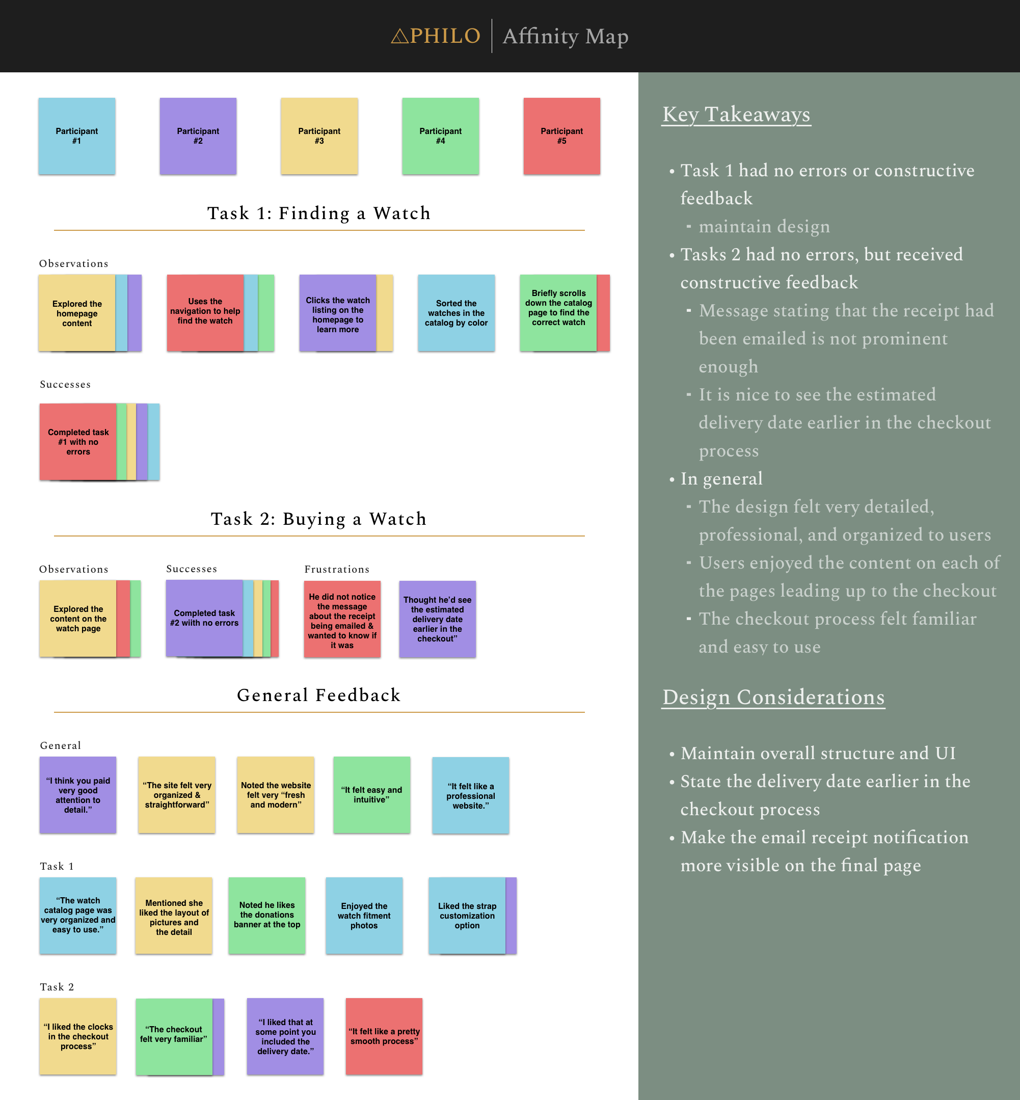
Once the UI Design had been completed, it was time to begin usability testing with potential users. Using the Invision App, I created a desktop prototype of the Philo website. I gathered 5 participants between the ages of 24 – 27 that had previous experience shopping online for a watch. They were provided with two tasks that I facilitated and moderated remotely. Task 1 was to find a popular men’s watch that was white, gold, and has a brown strap. Task 2 was to then purchase the watch.
Evaluating Findings
After conducting the usability tests, I recorded my notes in a document and then placed those notes on virtual post-its in an Affinity Map. I then found commonalities in each step regarding observations, successes, frustrations, and feedback. I also left room for general feedback at the end of the test which I then placed in sub-categories as well. This process helped organize the data collected during the usability tests to form helpful insights for potential design improvements.
Iterations
Overall, the design seemed to be successful during the usability tests. Some minor adjustments I made were to the checkout process. These adjustments included making the email message at the end of the checkout more visible and having estimated delivery dates stated earlier in the process.
Want to give my prototype a try? Click the “View Prototype” button below and complete the following tasks!
Task 1:
You are new to the website and are interested in finding a popular men’s watch that has a gold case, white face and brown strap.
Task 2:
After exploring the page and learning more about the watch, you would like to make the purchase.
Validate the design through website data and analytics
Reflection
Through this experience, I learned the importance of making customers feel comfortable and familiar when shopping online. During my user interviews, it was apparent to me that shoppers wanted to quickly find items they were interested and compare them based on decisive criteria. Criteria most commonly involved style, price, reviews and material. With efficiency and ease-of-use being critical to users when online shopping, providing a familiar shopping experience was crucial. It was also clear that when shopping online for clothing or accessories, product photos were extremely important. Not only for the purpose of showcasing the style of the product, but also to provide an idea of how the item will fit the user. It is difficult for shoppers to be 100% certain of their satisfaction when ordering something new online, so having plenty of imagery and fitment information helps users feel more confident in their decision.